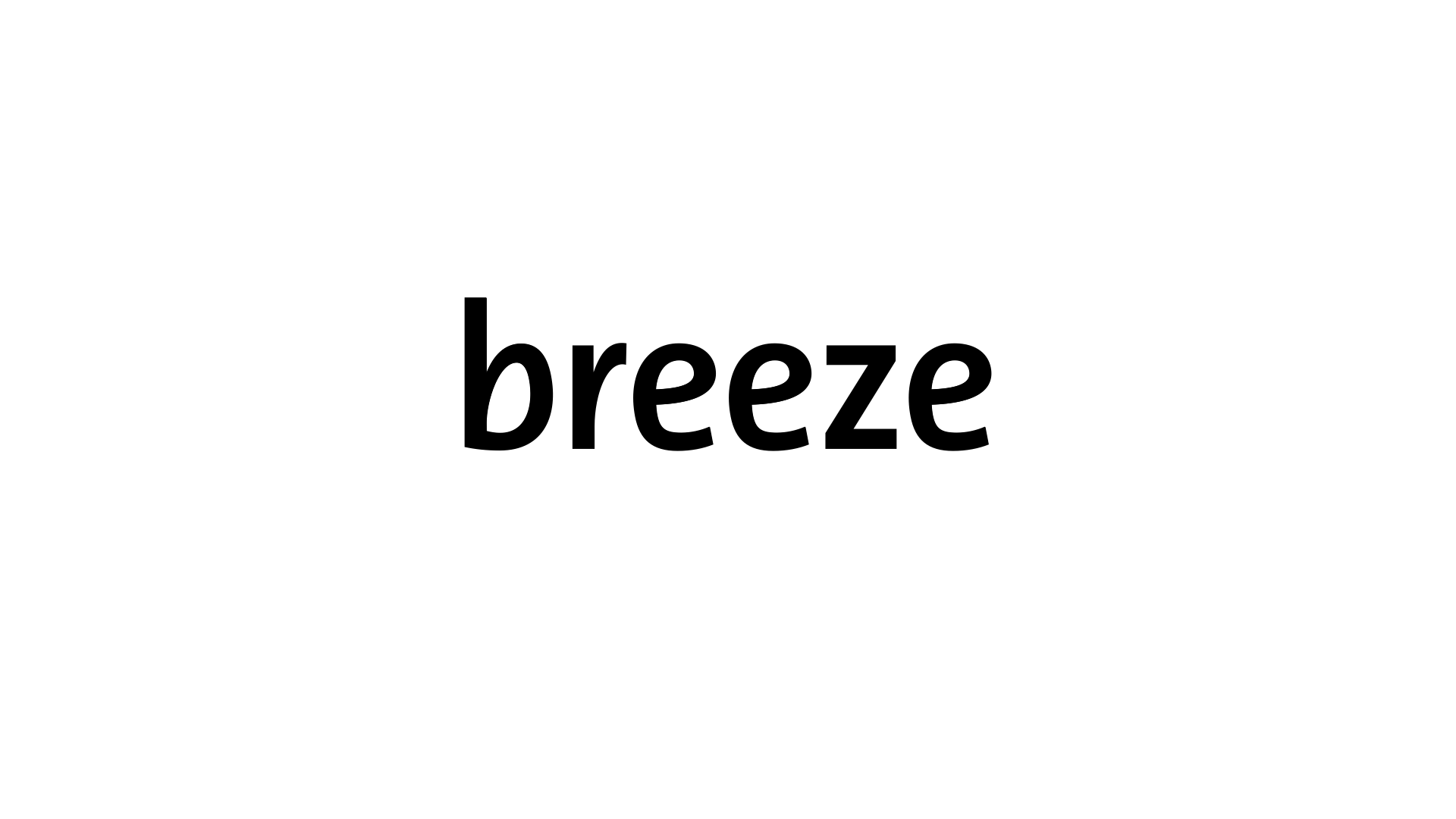
Breeze Logotype
Description
Breeze Logotype
Breeze is a firm of energy brokers who set out to bring some fresh ideas to the selling of gas and electricity. The logotype aims to capture this spirit with a design that combines the friendliness and fluidity of an italic typeface with the authority of a Roman face. Italicised logotypes frequently present problems in complex implementations as they tend to be difficult to combine with other elements. By designing a logotype which behaves like a Roman face but retains the calligraphic nature of its italicised sibling, this logotype projects the desired image as well as being easy to use.
Client information


