OVG Oberhavel Verkehrsgesellschaft Identity
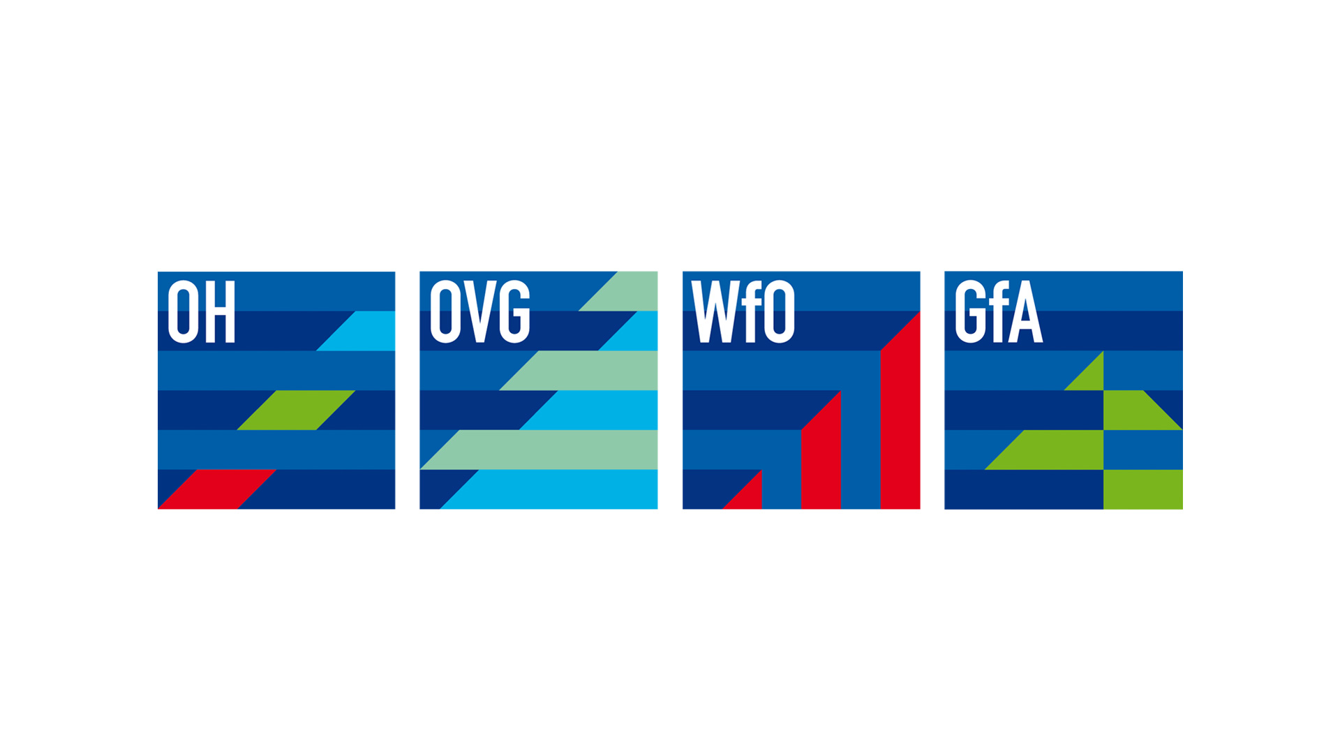
A family of marks was designed to communicate the confidence and efficiency of Oberhavel Holding and its three subsidiaries.
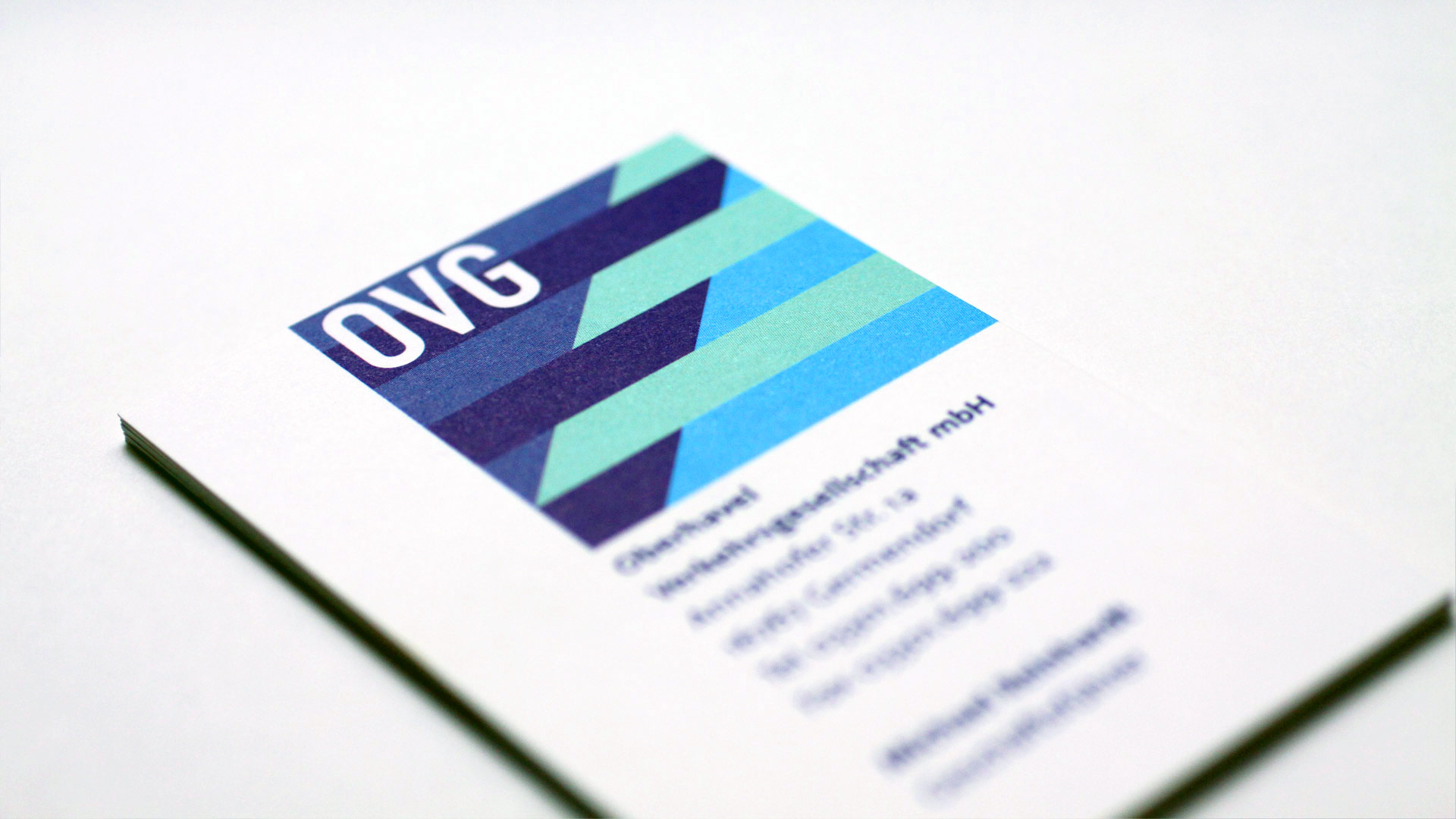
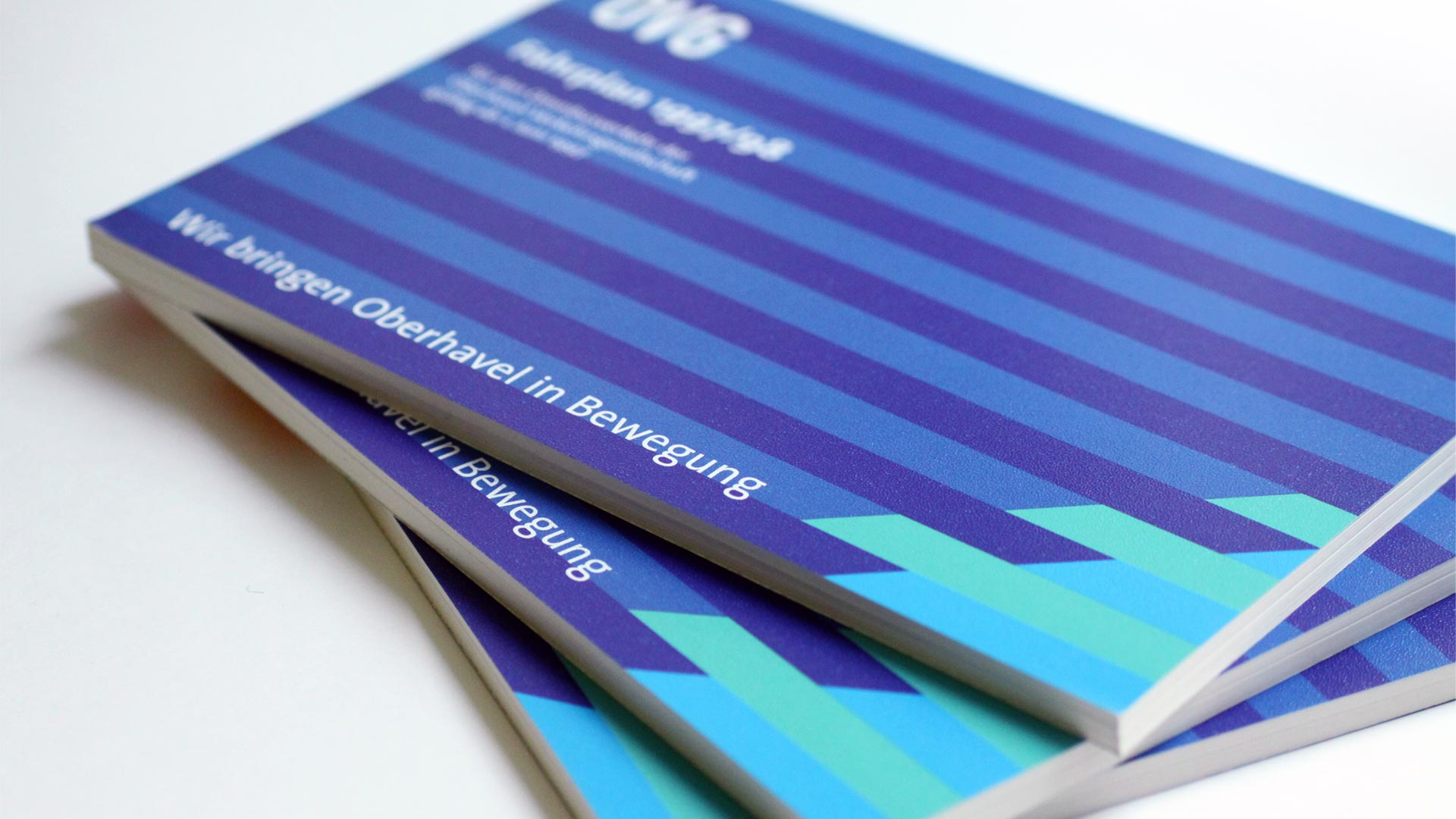
OVG’s symbol hints at the newly found dynamism of the public transport company. WfO's mark was inspired by a bar chart illustrating the rising inward investment into the region. GfA’s is an evolution of the recycling company's original symbol which showed a mountain of rubble being transformed into a green environment. The striped pattern common to all four marks expresses their close relationship.
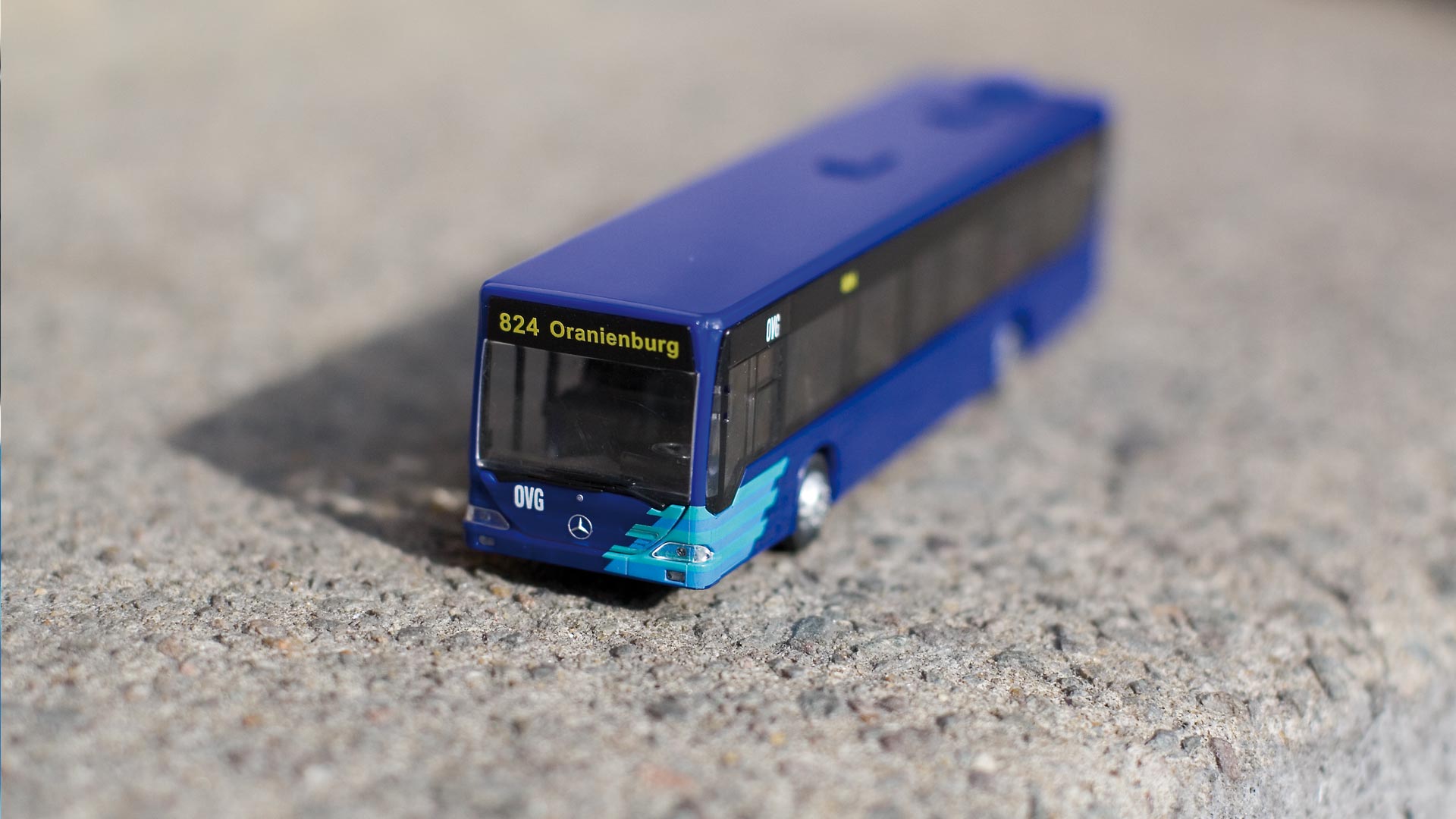
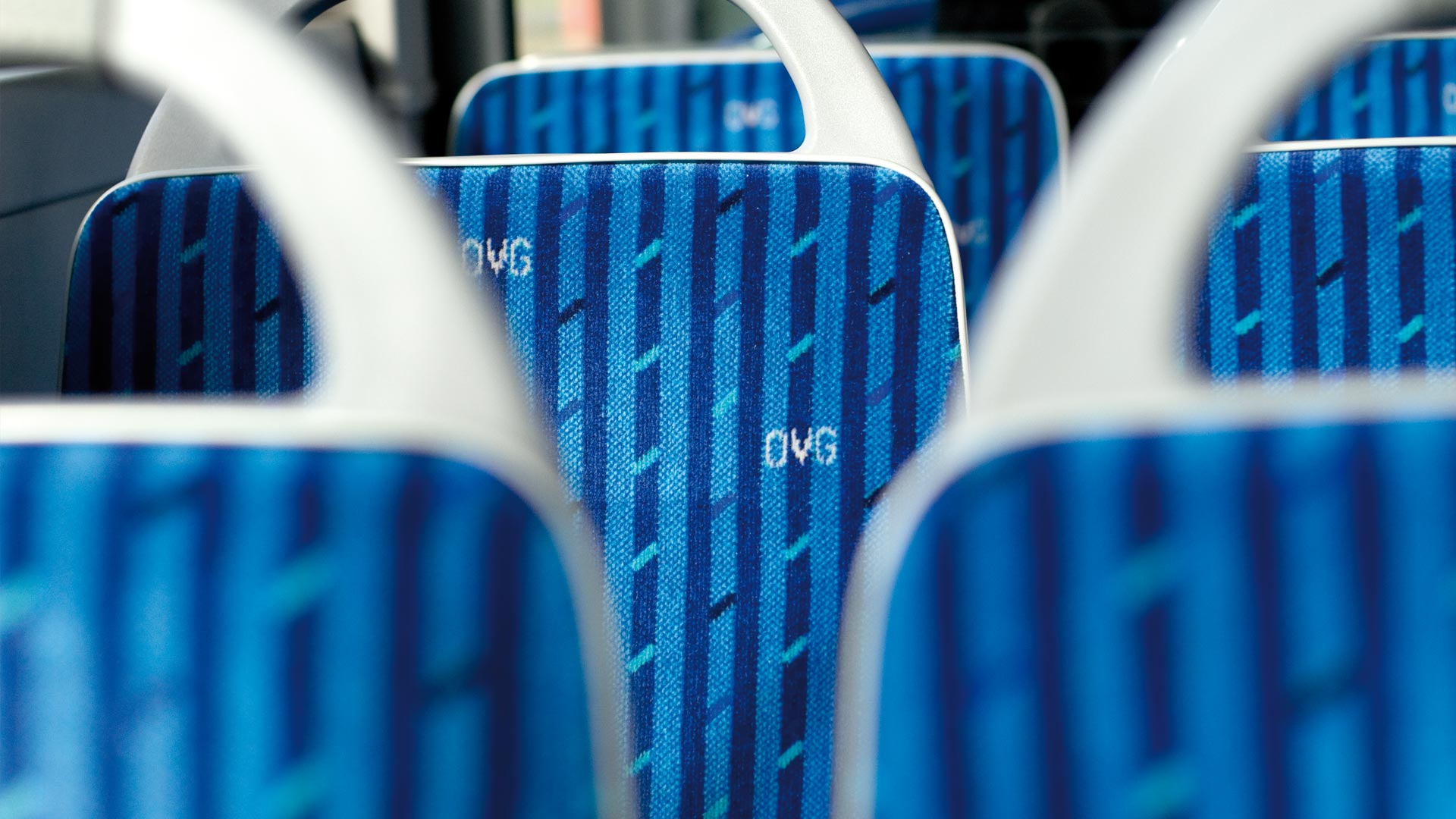
The marks also share an in-built adaptability which makes them workable at any scale and in different proportions, from the side of bus to a promotional pencil case for school children, uniforms, timetables, signage and upholstery.
