Lean Alliance Symbol
Description
Lean Alliance Symbol
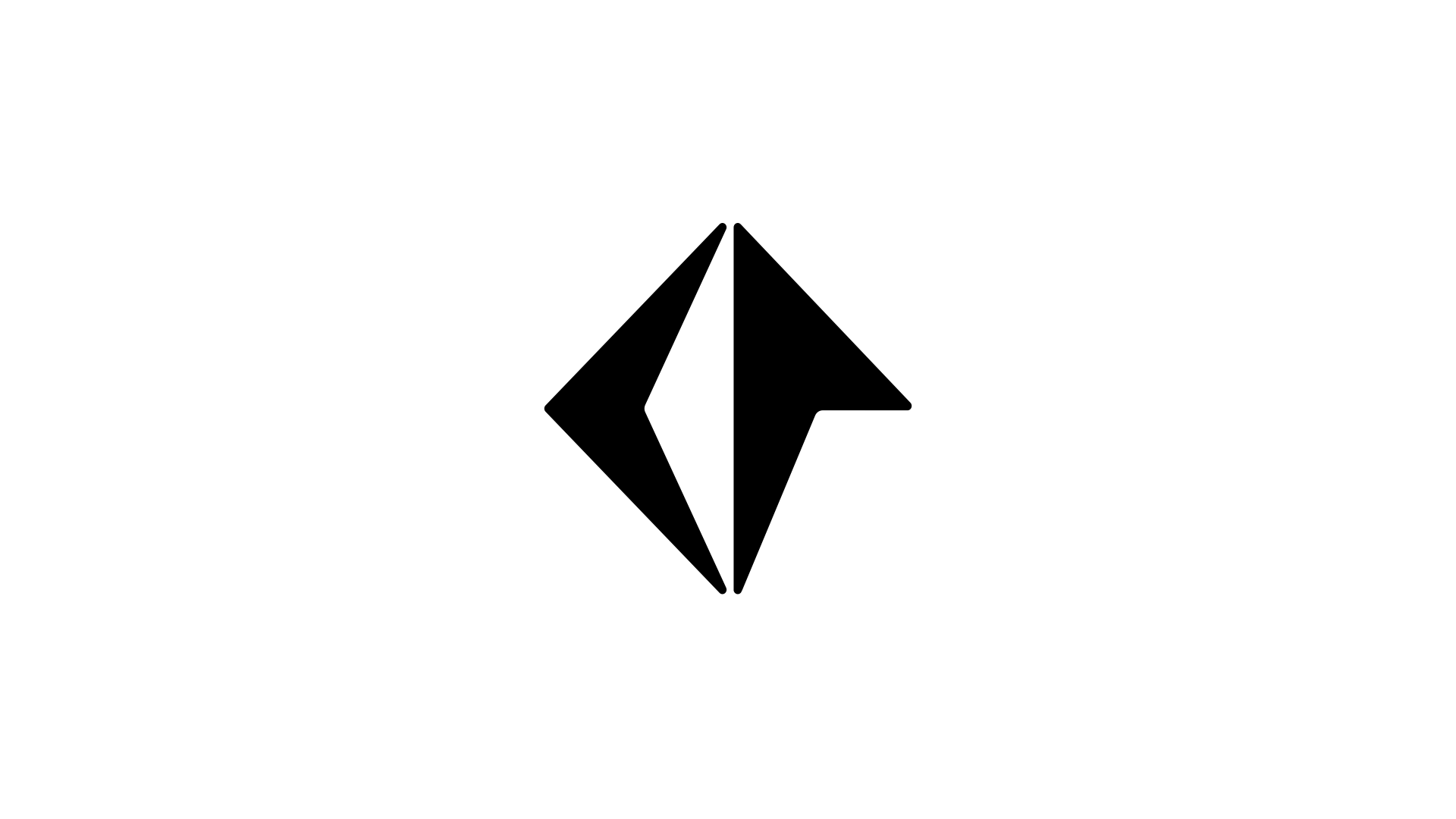
The Lean Alliance mark blurs the boundaries between symbol and logotype. Although the mark is built using the organisation's initials, Walter Haettenschweiler's Africaine typeface – a hidden gem that has never been commercially available – inspired abstract shapes that are barely recognisable as letters. The result is a diamond shape, that might not be legible, but is highly memorable.
Client information
